My shopping cart
Your cart is currently empty.
Continue ShoppingInstagram @lightandairyphotog
You’re going to be able to shoot better, dreamier, light & airy photos WITH YOUR PHONE if you follow along and apply each tip!
We believe that while learning to take pretty photos takes practice, you'll be a pro phone-ographer in no time! ;) Important moments go by too fast not to know how to use the one camera you’ve always got on you to it’s full potential!
So let's kick things off, shall we?! :)
__________________________________
TIP ONE: Start noticing LIGHT as an always changing, moving thing!
We ALWAYS teach people how important it is to choose where you're shooting your photos FIRST based on LIGHTING... and second based on backdrop. It's super tempting to notice a pretty backdrop and think that if you shoot there, you're going to get great images! But the truth of the matter is... you could take a way prettier photo in front of a less pretty backdrop if the LIGHT is pretty... vs. in from of a pretty backdrop with bad lighting.
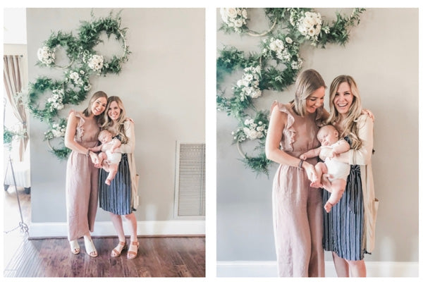
ARTIFICIAL LIGHT VS. NATURAL LIGHT
What makes the best lighting for pretty photos? NATURAL, soft, clean lighting!
Artificial light (like the lighting on the left... the kind that comes from pendants/lamps) usually casts weird colors and shadows on skin and can be really tricky to edit! Simply by switching off the overhead lights when taking the image below, it allowed the clean natural light to pour through the windows and light the shot perfectly!

Bonus Tip: if you open a window and have harsh light hitting your subject, try hanging a white sheet over the window to soften the light... this will diffuse it and give you the brightness without the harshness!
We also recommend choosing to do activities where you'd want to take beautiful photos during hours when you'd have natural light! Notice how it's much harder to capture pretty images in the dark than during the day? It can feel funny to schedule activities around when you can take great photos... but that's exactly how the pros end up with pretty photos!

HARSH LIGHT VS. DIFFUSED LIGHT
If you take a photo with the sun directly hitting your subject, you'll notice that it looks much harsher! The photo on the left was taken while the sun was still high in the sky... the photo on the right was taken later in the evening after the sun got lower (and therefore the light got softer)!

The best time of day to take pictures outside is usually in the two hours after the sun rises and the two hours before the sun sets! Why? Because at this time of day, the light is naturally softer and more diffused since the sun is lower in the sky.
Obviously you're not going to wait to take *ALL* your photos in either of those two hours segments of the day though! LOL... that wouldn't be realistic!
So during the mid-day hours of harsh sunlight, shoot in the shade (like the example on the right above!) or inside near a window!
For Tip Three, we're going to teach you HOW to use the light and the shade... but for now, just start noticing how buildings, trees, etc. cast shadows that create softer light where you can take photos!
We are always looking for EVEN shade... shaded areas that don't have dapples of light that would put spotted blotches of light on our subject!
For now... that's all you need to know. ;) But for Tip Three we're going to teach you HOW to use the light so that it's always even!
So your Tip One Takeaway is to start noticing LIGHT as an always changing, moving thing!
__________________________________
TIP TWO: Start choosing the RIGHT backdrops!
A key to taking light & airy photo is choosing the right spots to take photos... some of this stuff may feel like a no brainer, but it’s the little details in this that matter and can make ALL the difference in elevating the look of the photos you take with your phone!
Important note: This tip will vary based on the color scheme you're going for with your photos... If you love the light and airy look then follow these tips to a T! However, if you prefer a different color scheme the real trick is to choose consistent colored backdrops which will help make a group of photos in a portfolio, on your website, or on your Instagram feel professional and cohesive!
For light & airy photos, the FIRST and most obvious way to do this is to look for LIGHT colored backdrops versus heavy or darker colored backdrops. This makes a bigger difference when you're planning to use the photo for Instagram! Some of the first photos are still great! But choosing light colored backdrops can help your Instagram feed feel more light & airy!
If you’re shooting a photo of people, instead of choosing a heavy brick wall, choose a light colored wall:

Pay attention to the ground too! This makes a difference especially if you’re posting the photo to Instagram… darker ground will make a picture feel heavier in your Instagram feed! The left photo is great too, but the right photo will make your overall feed feel more consistent!

It could even be as simple as choosing a lighter colored chair over a dark colored chair!

And if you don’t have a light chair or couch… no worries!! Get creative! Throw a light colored blanket over a chair to get the same effect! Again, both photos are great but the right one with a lighter backdrop just feels a little lighter!
If you’re shooting a layflat or styled photo.... select a light surface. And if you’re like Anna and don’t have white marble countertops in your kitchen, never fear! You can buy a styling mat from companies like Kiss Books or make your own styling board by stapling linen fabric to a large canvas from a craft store!

A styling board can make all the difference!

BONUS TIPS: Three Things to Avoid
1. Avoid the CLUTTER - clean it up, crop it out, or move it to the side! Photos are usually better with less stuff in the background!

2. Avoid DISTRACTING ELEMENTS - you can often do this by shooting TIGHTER meaning closer to your subject! This allows your eye to focus on the subject better! In the right photo you focus more on the pretty wreaths and us... rather than in the left photo where your eye is distracted by the air conditioner and sign holder on the sides!
3. Avoid DARK HOLES - these are really dark areas in the background of photos that distract your eye and can make a picture feel really heavy!

So there you have it! Congratulations on making it TIP TWO!
__________________________________
This is where it really gets good... learning HOW to use light is where the magic happens! This is going to CHANGE THE GAME for the photos you take with your phone!!
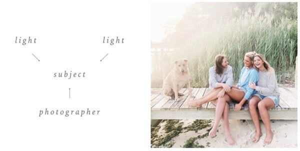
TIP THREE: Start finding and using Even Light whenever you can!
Even Light is our term for the light you'd find in the shade of a building (against a wall!), under the shade of a tree, inside a home, or on a cloudy day! It's the MOST flattering and easiest light to shoot in with your phone because you don't have to worry about any harsh shadowing, squinty eyes, or that pesky hazy sun flare.
Whenever possible, we try to find this kind of shaded Even Light to shoot in... it's where the magic happens! We love shooting our phone photos in Even Light because it puts the focus right on the subject and makes for the best light & airy phone photos!
Pay attention to the light around you! If you're about to take a picture in a spot with harsh light (whether it's directly in your subject's face and super harsh *OR* directly behind the subject and causing haze... both are a no-go!!), look around and see if there's anywhere close by that would provide a good backdrop with Even Light! It's our top priority!
Ok so let's say you're taking a picture of your child at their first class field trip to a pumpkin patch... where the mid-day sun is harsh and bright. Without an Even Light option in sight. WHAT DO YOU DO?!
When an Even Light spot isn't an option, strive for DIRECTIONAL light NOT direct light.
What the heck does that mean? Very simply put, it means taking photos so that the light is BEHIND your subject AND at a slight angle to one side or the other.
Rather than having the light DIRECTLY hitting your subject from the front.
DON'T DO THIS (it will result in a super harsh looking photo like this...):

DO THIS INSTEAD (position the light to come in from behind and at a slight angle on one side):
It also means that you *aren't* shooting directly INTO the sun... if you have sunlight hitting your phone's lens it will make your photo look hazy... move your feet until you're shooting with the sun behind and at an angle so that the photo doesn't look hazy!
And lastly, a little bonus tip: sometimes you'll notice that your photo looks dark on your phone when shooting it... it can be tempting to use the tool that allows you to pull up the exposure before you shoot the picture! But you'll find that it's USUALLY much better to shoot the picture darker and then pull up the exposure later when editing it! (we'll walk you through how to do that!) This saves more of the detail and highlights in the photo!
Learning how to use light is one of the hardest things to understand on paper... but once you start practicing with these key principles (making sure the subject and background are both well lit, searching for Even Light or when in a pinch: shooting with the sun behind and at an angle) it's going to click when you see the difference it makes!
__________________________________
Tip Four is all about learning COMPOSITION. This is one of those fancy shmancy photography words that really just refers to how you're FRAMING your photos! Framing your photos well means they'll be more pleasing to the eye, which of course is the goal...
TIP FOUR: Start paying attention to LINES (we'll break down exactly what this means don't worry)!
Composing a picture well is all about focusing on what the lines are doing... they could be actual visible lines in your backdrop... or they could be invisible lines as you picture a GRID over whatever you're shooting.
Let's start easy and talk about that grid...
THE RULE OF THIRDS:
Picture the lines of a tic tac toe board across your phones screen... The Rule of Thirds says that your subject should be lined up with one of the four intersections in the photo. This helps it feel balanced!

See how Anna's face is in line with that top right intersecting point? If your subject is farther away, focus on lining up the subject as a whole with any of the four intersecting points... if your subject is much closer, focus on lining up the subjects EYE with one of the intersecting points!
HORIZON LINES:
When it comes to the horizon... the most important factor is that it always appears level! A tilted horizon line is very distracting and takes away from a photo!

BONUS TIP: The Power of CROPPING!
It's of course always BEST to frame a photo perfectly when you’re shooting it… but sometimes cropping it closer can make a good photo REALLY good. It allows you to reframe it a little differently or remove distractions from the background!
Remember, it's best to move your feet or change up your angle slightly to crop out the distraction WHILE shooting, but if you don't realize to in the moment, using the crop tool later is handy!
__________________________________
If you love soft colors and want to take it one step further to take your photos from great to AMAZING… Tip Five is all about EDITING your photos ON YOUR PHONE!! :)
TIP FIVE: Edit your photos to take them to the next level!

Second, import an image into your shiny new Lightroom App so you can follow along as we guide you through editing!
We know that editing can be one of the hardest skills to master, so if you want to skip the trial and error of learning to edit on your own… you can check out our L&A Lifestyle Mobile Presets here and quickly transform your images! It's the recipe that took us years to perfect… for gorgeous, light & airy images every time!
Now that you have an image in the Lightroom App, let’s talk about the most important adjustments to make to a phone image!
There are two basic aspects to the light & airy style: a brighter exposure and softer colors.
We’re going to break this down into two sections to give you a little intro to editing. If you own The L&A Lifestyle Mobile Presets, skip to section two! If you don’t own the presets, then start with section one to learn about adjusting colors yourself...
SECTION ONE:
The HSL Panel: In Lightroom Mobile you can find it by clicking COLOR and then "MIX."

Learning to use this is the secret to soft colors and creamy skintones!
HSL stands for Hue/Saturation/Luminance and controls the intensity of the colors and tones in your photos. Collectively adjusting these is how you create the L&A look! This is like MAGIC in our opinion, because it allows you to adjust individual colors!
So what does each panel change?
Hue: The overall TONE of any given color. For example, greens can be more yellow or more blue. Basically it allows you to replace the shade of colors with neighboring ones on the color wheel!
Saturation: The intensity of any given color. This allows you to make any color stronger or more muted.
Luminance: The brightness of any given color. This allows you to make any color brighter or darker!
Much like the coffee, cream, and sugar in your morning cup of joe, you'll want to find your perfect ratio of Hue, Saturation, and Luminance for each color!
So how do you find the perfect color or know what to adjust?
In our experience, the two most important factors to focus on adjusting in a photo to achieve the L&A look are the greens and skintones! Therefore, we mostly focus on changing the greens, yellows, and oranges with The HSL Panel!
L&A Greens: We love greens that are soft and dreamy! To achieve an image like this try dragging the Green Saturation slider to the left and the Green Luminance slider to the right! Click the green dot and you'll see this panel where you can adjust your greens!

L&A Skintones: Most skintones are some combination of orange, red, and yellow. The trick is finding the right balance between the colors to achieve a soft look.
Think about it like a MAKEUP ARTIST! Different people need different color foundation because we all have different undertones to our skin... some people have more cool, pink skin, while others have more olive, warm skin!
START WITH ORANGE: When it comes to skintones, start by adjusting the ORANGE Saturation and Luminance. We prefer to pull the Orange Saturation slider down a bit first. Then play with the Orange Luminance slider... if you pull it to the right, it will make skin appear brighter. If you pull it to the left, it will deepen the skintone!
If skintones look too pale, try pulling the Orange Luminance slider to the left first. And if skintones look too much like an Oompa Loompa, pull the Orange Saturation slider to the left, too! Just click the orange dot and make your adjustments there!

We use the same recipe on all of our photos to make it easy to achieve consistency in our photos and feed! If you're interested in a shortcut, you can check out our mobile presets here!!
SECTION TWO:
1. ADJUST BRIGHTNESS
Whether you use The HSL Panel to adjust the color manually, or already have the presets and simply apply your fave... your next priority will always be adjusting the EXPOSURE SLIDER. Pulling this slider to the right will make your photo brighter!

Also by bumping the SHADOW slider up, it strips the heaviness away while simultaneously bringing out the detail that may have been lost in the darker areas of the photo.
2. ADJUST WHITE BALANCE
Lastly, adjust the white balance of your image under the "COLOR" section by sliding the TEMP and TINT sliders left or right.
"TEMP" controls how WARM or COOL your photo will be.
If your photo looks too cool or blue like the photo on the far left... try pulling the TEMP slider to the right!
If your photo looks too warm or orange like the photo on the far right... try pulling the TEMP slider to the left!

Similarly, TINT controls how GREEN or MAGENTA your photo is.
If your photo feels too purple like the photo on the far right, pull the tint slider to the LEFT!
If your photo feels too green like the photo on the far left, try pulling the tint slider to the RIGHT!

Achieving proper white balance takes practice and time as you train your eye! But as you get intentional about noticing if your photos look too warm or cool... or too green or purple, it will become easier to see and adjust the color!
Lastly, export your photo by clicking the arrow button in the top right of the app then save it to your camera roll!